yaourt.plot.benchmark#
Benchmark plotting helpers.
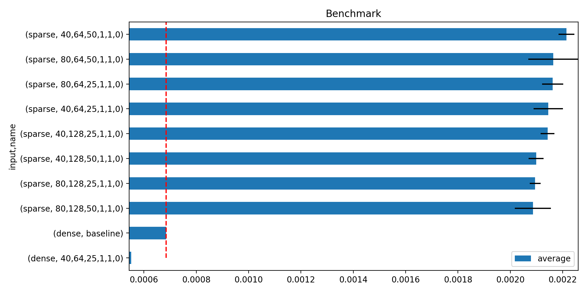
- yaourt.plot.benchmark.hhistograms(df: pandas.DataFrame, keys: str | Tuple[str, ...] = 'name', metric: str = 'average', baseline: str = 'baseline', title: str = 'Benchmark', limit: int = 50, ax: matplotlib.axes.Axes | None = None) matplotlib.axes.Axes#
Plots horizontal histograms with error bars for benchmark comparisons. Shows the limit best-performing configurations alongside the baseline.
- Parameters:
df – DataFrame containing benchmark results; must have columns matching keys and metric, plus
min_execandmax_execcolumns when they exist (used for the x-axis limits)keys – column name(s) to group by; the last key identifies the baseline row via baseline
metric – column name holding the primary performance metric
baseline – substring used to identify the baseline row in the last keys column
title – chart title
limit – maximum number of non-baseline rows to display
ax – existing matplotlib axis; a new figure is created when None
- Returns:
the matplotlib axis
(
Source code,png,hires.png,pdf)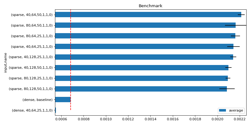